This work stems from the classification done by the Wikipedia moderators to cluster pages related to fake news and COVID misinformation. To learn more about the external databases used here, have a look at the toolbox section we created.
Hope you enjoy reading our story!
In this initial section we will try to identify where Wikipedia articles related to fake news stand in the general huge landscape of Wikipedia articles. Especially, we are interested to see if there was a spike of interest for fake news during COVID, (and in particular for fake news regarding COVID). Of course the causes of this phenomenon could be multiple and are not easy to determine. However, by normalising the data with respect to the normalcy (COVID general increase in views during the pandemic) we can at least attenuate the effects of boredom. In fact, we know that people started being more on the internet during the lockdown, and also wikipedia general views boosted.
Using Wikimedia’s API we were able to extract the number of views per day for a defined set of articles. Using this information, we got the percentage of increase of 2020 wikipedia article compared to 2018. Consequently, we do the difference between the views in 2020 and 2018, divided by the average daily value of article in 2018.
Data Grouping: We segregate the data into two groups - “Before Lockdown,” where we consider the comparative increase before the lockdown, and “In Lockdown,” where we analyze the comparative increase during the lockdown. Subsequently, we conduct a regression analysis between the two groups to identify any significant differences.
Analysing in more depth the different COVID misinformation main categories, we use difference in differences method to study the effect of mobility changepoints on a treatment group (views in 2020) vs. a control group (views in 2019 or 2022). Subtracting the 2019 difference from the 2020 difference (yielding the “difference in differences”) thus removes changes that would have occurred even without an intervention.
To investigate this, we compare the relative increase in pages before and during the first COVID lockdown period (March 2020 to May 2020) by analysing the evolution of interest in fake news articles. We aim to differentiate the increase that cannot be explained solely by the overall rise in Wikipedia usage.
Initially, we calculate the percentage increase in Wikipedia views compared to the baseline of 2018. Additionally, we determine the percentage increase in Wikipedia conspiracy theory views compared to 2018. Next, to isolate the increase specifically related to fake news, we subtract the increase in conspiracy theory views from the overall Wikipedia increase for each day. This provides us with the comparative increase in Wikipedia articles related to fake news.
From the box plot, we see that before the lockdown, conspiracy theories had a median increase in attention of 16% above the global Wikipedia augmentation in views, and during the lockdown, it went up to 68%. Furthermore, we observe that the increase is significant, as the boxplots barely overlap each other.
The linear regression between the two groups confirms statistical significance, with p=0.00 (0.00% chance to get this result from the null hypothesis). The coefficient (Coeff) of 0.482 implies a 48.2% augmentation in views, and the R-squared value of 0.692 indicates that the lockdown explains most of the variance.
We clustered the fake news into different categories and plotted them in a pie chart representing the variation before, during, and after lockdown. For the before lockdown period, we considered the average views from January 5th to January 10th. During the lockdown period, we considered the average from April 5th to April 10th. After the lockdown, we considered the average from May 30th to June 3rd.
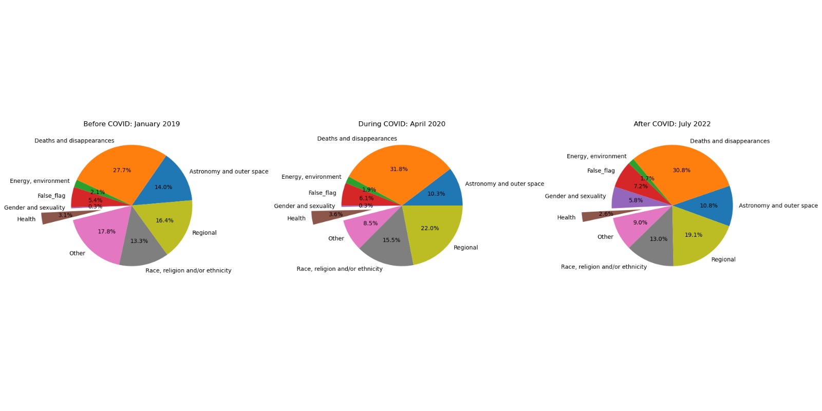
We observe an increase from 2.2% to 3% during the lockdown, followed by a decrease to 1.3% in health-related fake news. There is a significant increase in regional fake news from 19% to around 40%, and a decrease in death and disappearance-related fake news (20% during the lockdown). A very similar analysis to the one done before was done to study if there is a significant increase in interest in COVID-related fake news with respect to all fake news, indeed we found that this is the case.
To study this phenomenon more closely, we introduce a new dataset: the COVID-19 misinformation dataset. To build it, we parsed the COVID-19 misinformation page and extracted the articles referenced inside each paragraph. We construct six main categories: Virus origin, Incidence and mortality, Disease spread, Prevention, Treatment, and Vaccine misinformation. We ensure to keep only the relevant articles through feature analysis. With this, we can do a Difference in Differences method by main category of fake news and quantify the shift in interest per category. In this way, we can quantify the impact of mobility on the activity on Wikipedia. For the method we extracted only the data 20 days before (pre) and 20 days after the mobility changepoint (post) for both control and treatment groups to assess its impact on the increase of visits. From this method we obtained the corresponding increase in pageview as percentage. You can see this relative increases for English for 2020 with respect to 2019 and for 2022 with respect to 2020 in the following plot. Note that the relative change for 2022 are plotted as absolute values to compare magnitude in change. But the actual values for the 2022 control are negative (decreased from 2020).
This allows us to quantify the variability in interest, meaning that the categories with a higher relative change were the focus of attention. For instance, for English pageview count we found that the Prevention category had the highest increase in 2020 (with regards to 2019). This was equal to 199%, while the Virus origin has the biggest decrease 2022 (with regards to 2020) being 284%. This is similar to the trends seen in the piecharts above.
Conclusions
We could prove that indeed there is a significant increase in attention in fake news from before vs. during the lockdown, and especially in COVID-related fake news. Regarding the themes that sparked the most interest, prevention and mortality are in the first places.
Now that we explored in depth the Wikipedia fake news and conspiracy theory landscape, and prove that indeed it it was a hot topic of interest, what can we say about Wikipedia as a tool to study COVID misinformation? To study this link we try to make a comparison between Wikipedia and fake news about COVID that were published on the web (MM-COVID dataset, see toolbox). If we find that most of the articles can be categorised by the topics labeled as misinformation from Wikipedia, then we can say that Wikipedia is representative of the subjects covered in the dataset, and on the web. What is even more interesting, is that we can analyse the evolution of interest related to a certain topics (page view count) in time. Managing to prove a causation between Wikipedia interest and fake news publication is almost impossible because of the uncountable number of confounders that play a role in Wikipedia visits. However, having access also to the dates of publications of fake news, we want to see if we find a correlation between the two.
From the Fake News Topics defined in Part 1, we use the subtitles and sub-subtitles of each main category from the Wikipedia article to build a bag of words (BoW) to classify the web news dataset. With this, we have a bag of words for each main heading which represents the topics covered. We then classify around 2000 English fake news articles into the six categories if the claim (short description of the piece of news) contains words from the BoW. Note that a piece of news can be classified into more than one category.
We plot a weighted average of the viewcounts from the selected articles next to the daily article release trend of the news dataset. We then measure the correlation between the two trends to show that release and wikipedia interest are also linked. Going more in depth, we leverage the pre existing wikipedia article structure to perform an analysis of Fake News interest according to our Fake News topics. We plot two kinds of graphs: one which highlights the relative speed of viewcount increase (virality) compared to the wikipedia baseline, and one which highligts the relative increase (popularity) compared to the wikipedia baseline.
Virality (speed of viewcount increase): For this, we evaluate the global trend of article views from the Aggregated timeseries dataset by convolving a derivative filter along the total view count of articles and then applying a min max normalization. We then apply the same process for each article. We then substract the global trend from the article trend. This highlights the difference in virality between the considered article and the general virality of articles on wikipedia. For each Fake news topic, we then aggregate all of their linked articles through a weighted sum (coefficients based on article mean views per selected period / sum of article mean views).
Popularity (percentage of viewcount increase): The process is exactly the same but we do not apply the derivative filer and proceed straight to min max normalization.
First we look at the news dataset and we try to cluster them into categories. After classification, we managed to classify 85% of our news! This value is highly dependant on the words that we exclude from the bag of words (‘COVID’, ‘2020’, etc.). In fact, if we leave all the words this value increases to 100%. It is highly subjective on which words are most useful to keep or those that skew our frequencies and need to be removed. Still, we believe our choice for classification is valid.
Now let’s see how the classification looks like. We must keep in mind that each piece of news can be classified in many categories. Therefore, when plotting, when we sum the percentage of classified news for every main heading, the total will be more than 100%.
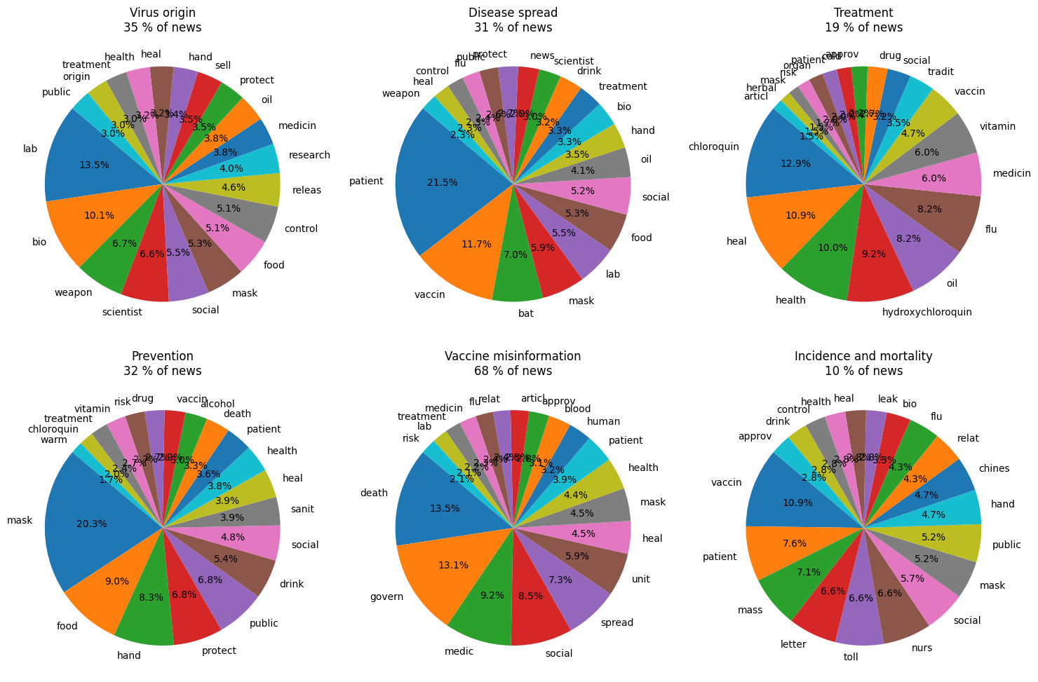
Many of these findings coincide with our expectations: for example, bio-weapon, scientist, and food are in the first positions in fake news about the origin of COVID, while bat, mask, and vaccine are in the top 4 for disease spread. Hydroxychloroquin seems to be the most important drug that is included in fake news about COVID treatments. Interestingly, the words corresponding to vaccine misinformation are found in 70% of all fake articles, with “death” in the first position.
We now want to find if there is any correlation between the normalised number of visits and the normalised averaged number of news published in time. Consequently, we are going to test this correlation using Pearson and Spearman coefficient dividing the data in two parts: before the maximum and after the maximum.
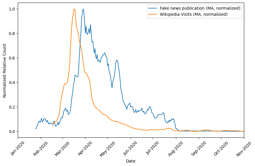
Before the maximum point: Pearson coefficient = 1.0, Spearman coefficient = 0.99. This indicates a perfect positive linear relationship between the variables. This suggests that the variables (#news and # vists) move closely with each other. After the maximum point: Pearson coefficient = 0.91, Spearman coefficient = 0.92. The values after the maximum point still indicate a relatively strong positive correlation between the variables but are lower compared to the values observed before the maximum.
Now that we have proved that the viewcount is a good match of the topics and behaviours of fake news publications in time, we want to establish a storyline of fake news interest during the different phases of the pandemic. We plot first the virality (speed of viewpoint increase), and then the popularity (percentage of viewpoint increase), comparing with the mobility.
The virality will allow us to discern the impact of each article by evaluating its rate of change in popularity relative to the normalised derivative of the Wikipedia view count, providing a more accurate measurement of its viral dynamics within the broader context of online content engagement.
The popularity will allow us to discern how much a given article deviates from the Wikipedia trendline after normalisation. Positive value means that the topic has a relative viewcount increase higher than the relative viewcount increase of Wikipedia. And therefore a greater rise in interest in the topic.
In the 15 days before the first death, all the fake news topics were increasing and decreasing in the same way as Wikipedia.
On the contrary, in the 15 days after, we observe another behaviour, the fake news topics were increasing more than the COVID articles. This means that there was a greater interest in fake news in comparison to other subjects on Wikipedia.
At the lockdown mobility change point, Wikipedia increased way more than the fake news topics. That’s why we see negative values. However, this happened only for 1 month; after that, the fake news topics were again increasing more than Wikipedia’s articles by a constant amount!
The topics all saw a relative increase in views after the lockdown. Therefore, there is a growing interest in the topic of fake news right after the lockdown. What’s interesting to note is that the topics show increases at different timings. It starts with the spread, then the origin, prevention, treatment, the vaccine, concluding with incidence and mortality. We can see a clear evolution with regards to the different mobility change points! Interesting observations can be made, like the successive rise in “Treatment” related fake news followed by “Mortality” related Fake News right after the beginning of Lockdown, this could be indicative of the initial optimism of a quick resolution fading to fear as the death toll continued to rise. Many things could be said from these graphs, and we invite you to make your own observations as well!
Now, the combined observations of vitality and popularity make sense as the COVID articles continued to increase, but not necessarily much faster than the global article trend which experienced a boom after the lockdown. It could be a sign that people were less interested in the doomsday news, as they were in finally enjoying some well deserved rest. However, this was only in the initial phase of lockdown, indeed, the relative interest in Fake news picked up hard:
Conclusion
The fake news dataset enables us to verify that the topics classified as Fake News on Wikipedia are representative of general media attention with an 85% match. This means that Wikipedia is a useful tool to study general media and user interest towards COVID-19 Fake News! We also confirmed a good “behavioural” match with strong correlation. From there, we used the pageviews information to study the virality and popularity of each topic with regards to the norm. We observe that each topic is closely related and they move together. It is also observed that mobility restrictions had a significant impact on our trends, with interest towards articles slowly rising after the first reported deaths, rising more slowly (relative to the global trend) after the beginning of lockdown, and the multiple categories continuing to rise alternate in popularity. These observations show that Fake News mostly picked up started appearing pre lockdown, but really picked up towards the later phases, with online attention probably driving the highly volatile interest for each Fake News topic.
Now that we have proven than Wikipedia is actually a good tool to study the phenomenon of fake news, we want to study the relationship between COVID Wikipedia pages for different languages. Since the Wikipedia pages in different languages don’t have the same structure (so we cannot compare main headings), we want to analyse the links they refer to. What kind of overlap is there between each language? In this way we can see the differences between more global and local articles and see if fake news tended to spread or to stay local.
To see the similarities in Wikipedia articles across different languages, we create a multilingual version of the COVID-19 misinformation dataset, with the links of pages for 9 different languages (English, French, Italian, Spanish, German, Arab, Portuguese, Russian, and Chinese). We also fetch the english version of the newfound links (if existing).
After an initial analysis, a pseudo-bag of words was created from the titles of the english version of the pages for every language. We clean the links, separating the words and removing stopwords and words that are over present, and then we count the number of unique words, along with their number frequency to create word clouds for each language.
Additionally, in order to quantify better the relationship between languages, we suggest the following two methods:
Firstly, we evaluate the Jaccard similarity of bows built for each language out of the titles of articles which were found to have an english equivalent. In this way, we can compare which languages shared common topics, something which perhaps could not be seen so easily in the word clouds. Secondly, we plot a chord diagram to study the common articles between languages. It is not normalised as not all articles are as detailed, and we can also see in this way the unequal dimension of the work done across multiple languages to record the spread of misinformation on Wikipedia, as well as topical commonalities.
As a preliminary analysis, we plot the percentage of Wikipedia pages that have an english version, along with the percentage of those who are present only in the native language and the average overlap of links between languages.
We can see that the percentage of articles which are present only in the original language range from 0 to 20% (maximum value for German). Interestingly, Arab has almost all articles present in the English version, and also has the biggest overlap with the other languages. This could be explained by Arabic being a widely spoking languages under a lot of different influences which leads it to be more impacted by mainstream news and have less focus on local and specific fake news. For the other languages we see a similar average overlap, except for Spanish and Portuguese, suggesting more localized content or distinct beliefs. For example, the Spanish page references incidents in Spain and Brazil not found in the English version and conspiracy theories targeted at COVID being a lab release from the united states which indicates potential regional influences and slightly divergent perspectives (compared to the mainstream beliefs).
Additionally, while this graph doesn’t directly tell us about the extent of the spread of misinformation in the countries which use the language, it certainly tells us about how exhaustive the work of Wikipedia Moderators was while trying to report COVID related fake news. This could perhaps be interpreted as the general effort of information sources from the countries speaking these languages to combat misinformation. But all of this is highly speculative, and open to interpretation. We simply aim to highlight possible links between articles which were considered as linked to fake news for different languages and regions of the world.
To better visualise in what topics the pages for different languages are similar or different, we created word-clouds that contain the most frequent words from the titles of Wikipedia pages about COVID misinformation.
Of course, COVID-19 is the most frequent word, and we can use it as baseline to compare the frequency of the other words. In fact, for certain languages all the other words are a lot less frequent and with similar frequency. Interestingly, for Spanish, French, and German the biggest words are ‘The Times’, ‘Le monde’, and ‘United States’ respectively. ‘conspiracy’ and ‘Trump’ have the second place in frequency. Some words we can see that are always present, like ‘China’, ‘vaccine’, ‘news’, but with variable frequency. In order to quantify visually the connections between languages, we can construct a chord plot with the thickness of the chords tying two languages that is proportional to the overlap of words present in the bag of words created from the articles which they cite (we only consider those which have an english version).
The chord plot down below shows the number of overlapping words between pairs of languages. This shows us the paths from one language to the other. By hovering over the chord plot, we can see that there is a big overlap between English, Spanish, Portuguese and the other languages (thickness of chords leaving these zones), while for the local languages there are many small streams that connect to other languages. This might seem logical, but we need to take into consideration that there is a big size effect given by the total number unique words per language, which are lower for the three international languages just mentioned. This can therefore skew our analysis.
To remove the size effect given by the very different number of words and number of links found, we compute the Jaccard similarity between languages. In the image just below we can find this value (percentage of overlap) for every pair of language. In green we can see the values above 0.15, while in red are shown the values below 0.1.
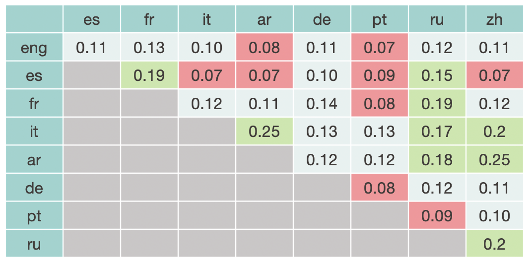
Now we see that the higher overlap is for Arab-Chinese and Arab-Italian, with 25% Jaccard similarity, while the lowest is for English-Portuguese, Spanish-Italian, Spanish-Arab, Spanish-Chinese (only 7%). Intersection with Portuguese are also quite low (always below 13%). It would seem that Spanish and Portuguese are isolated clusters of news, which are rather local and don't share many topics with the other languages. This effectively proves what we already deduced from the preliminary analysis of the histograms.
Conclusion
Even if this part is more qualitative than the others, it is still a solid analysis giving us insights in overlapping COVID-related topics for different languages. Through the metric of Jaccard Similarity, we effectively could infer that Spanish and Portuguese are isolated languages that don’t have many topics in common with the other languages. This was not expected, as they are languages spoken in many different countries. Perhaps this is telling of a lower effort from Wikipedia moderators to survey articles potentially linked to Fake News for these languages.
In this study, we tried to evaluate the usefulness of Wikipedia as a tool for studying misinformation across multiple languages and use it as a way to explore online users’ relationship with COVID-related fake news during limited mobility periods. Through the different steps of this project, we could extract some key findings.
First, we could prove that indeed there is a significant increase in attention in fake news from before to during the lockdown, and especially in COVID-related fake news. Regarding the themes that sparked the most interest, prevention and mortality are at the first place.
Then, we could prove that the topics classified as Fake News on Wikipedia are representative of general media attention with an 85% match. We could also create a timeline of interest and relate them with the mobility change points.
Finally, we could detect a surprising difference between localised and international languages, namely Spanish and Portuguese, which don’t have many themes in common with the other studied languages even if they can be considered international languages. Instead, languages like Arabic and Chinese seem way more cosmopolitan.